As of today, Moonbound is out in the world! You can find it wherever (maybe) books are sold. It’s a huge relief to have it all wrapped up, though now a new kind of anxiety creeps in, one that I have to train myself to ignore: that little voice in my head needling me about whether anyone is going to care. I’ve found that the only practical thing to do at this point is get back to drawing and try not to think about the things that are beyond my control.
Tools of My Trade
In anticipation of the release of my book, Field Guide Designs shot this beautiful taxonomy of all the stuff I use to make comics (and a couple tools from my bookbinding days). Now if only my studio was actually this organized…
Adrift
Somewhere on the Sea of Tranquility
Well, here it is...
Three years later, here’s the book, all 230-some pages of it. From this distance, it doesn’t look like much. Now comes the waiting. In a few months I’ll get a box with bound copies. Until then, this all seems like a dream.
Coloring
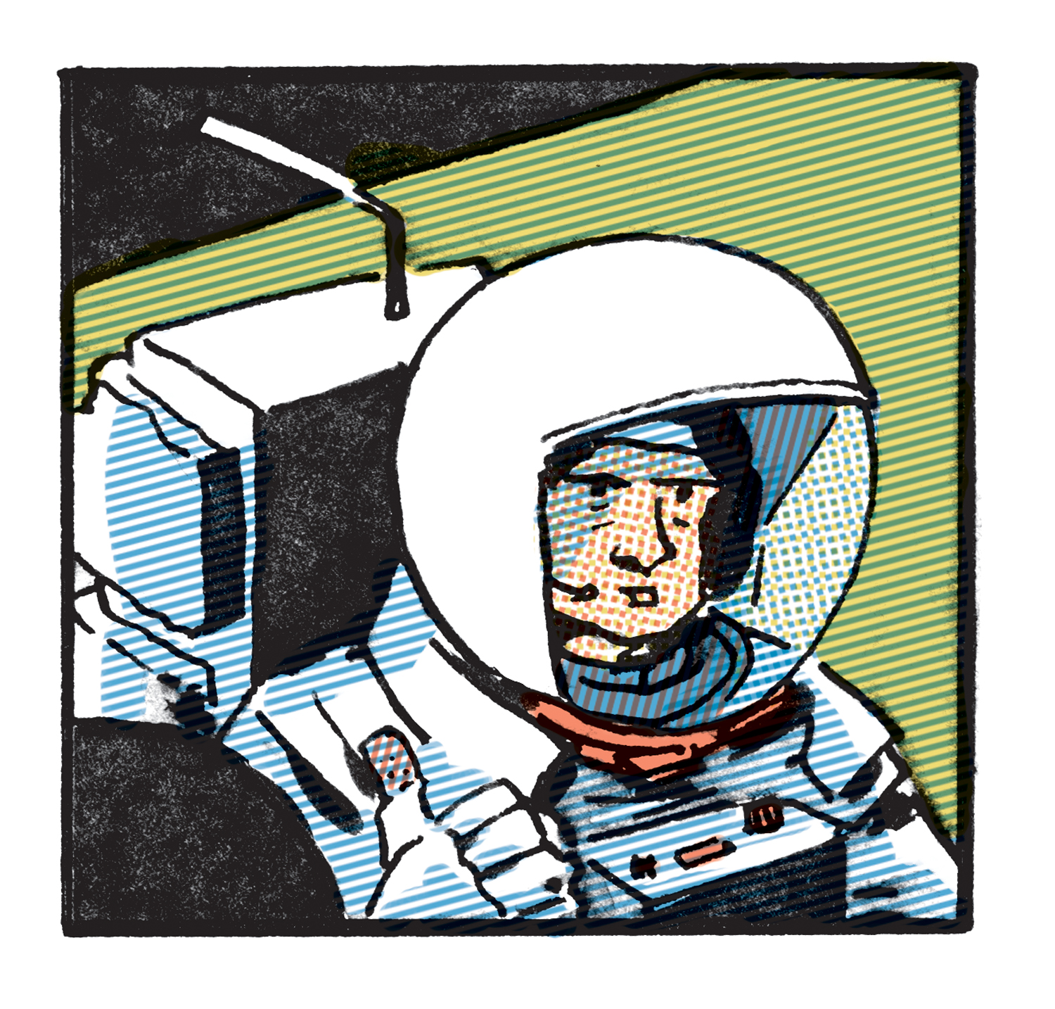
A sneak peak at my absurdly convoluted coloring setup. I’m basically trying to replicate the process of Golden Age comics — CMYK breakdowns at 100%, 50%, 25% — but with my own colors instead of process colors and flat tone instead of screens. I like the faded colors of old comics, but I don’t want to go down the path of pure imitation.
Cover time
Man, I hate doing covers. Way too much pressure. After too many drafts to count, I’ve finally got an image I’m happy with. Here’s a detail.
Headshots
One of my go-to framing devices when I’m composing a page is to think of it like a pile of documents on a table. I tend to approach comics, at least nonfiction ones, from the perspective of collage: my job is to paste together and arrange a narrative out of all of these documents and fragments. Most of the time the collage is implied, but every once in a while I try to actually show it on the page.
The Ruins of Antwerp
Using the light table to compose this splash panel showing the devastation of Hitler’s V2 rockets on the city of Antwerp. I tend to do this kind of layering/tracing for more complex scenes, as it helps me avoid feeling overwhelmed by all the details. I can draw a building, throw it on the light table, then superimpose some figures. And then for the final inks, I’ll either trace out the whole panel in non-photo blue pencil and ink, or else if I’m feeling spry I’ll just ink at the light table.
LBJ
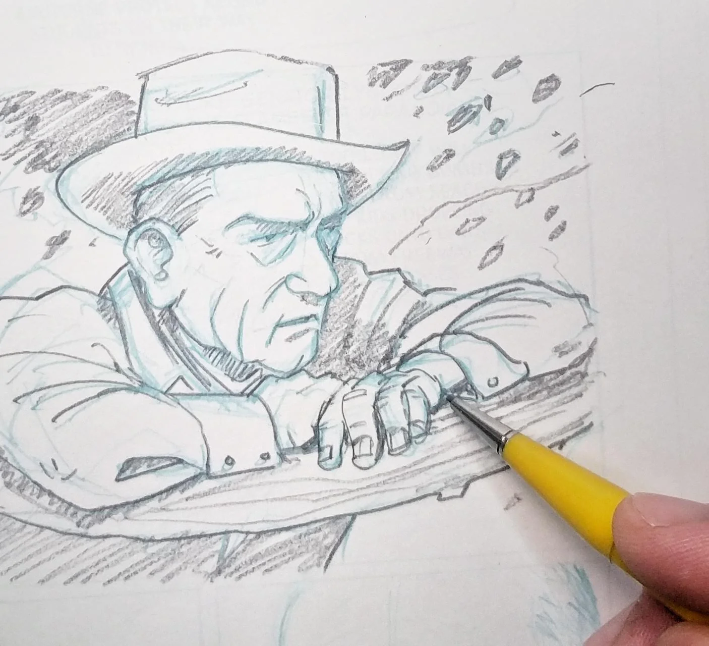
I ended up not using this panel of LBJ stoically leaning against an oak tree (from a reference photo). I like how it feels like a still from a John Wayne movie, but in the end, it didn’t really make sense with the narrative. Oh well. I’ll file it away in the “strange shots of former presidents” folder.
Mandorla
Close up of a panel about how the Soviet R7 rocket was designed to be able to hold a nuclear warhead, a satellite, or a cosmonaut.
Page 1 of...
I think I've finally settled on a way to color/texture the parts of Moonbound that are taking place in the 'past' (here's a scene from 1761 of Christopher Wren presenting his carved wooden globe of the Moon to King Charles II). I guess now that I've got it figured out, I should probably just chain myself to my drawing desk and start inking.
Betty Skelton, Mercury Astronaut #7½
She was the first woman to undergo NASA's grueling battery of physical and psychological tests that were developed to select the Mercury astronauts in 1959. NASA administrators scoffed at the idea of a woman in space, despite medical research suggesting that females were better suited to the stresses of spaceflight.
Research?
I want to go back in time to 12-year-old me and tell him that we will grow up to have the sort of job where buying a Lego set counts as a business expense.
Test, 2.0
I spent way too much time creating my own set of screens in an abortive attempt to replicate the effect of old duotone paper. Again, it’s cool in isolation, but I can’t imagine doing a whole book this way.
A test...
Playing around with textures and faded colors. I like the effect on individual panels, but when it’s all put together on the page it feels a bit overwhelming.
Richard LaPiere and the Science of Discrimination
Or, The Whale
Here's a print I did for the Threadbare Theater Workshop's upcoming stage production of Moby Dick. The quote is one of my favorite passages from the book. I could do Moby Dick themed art all day, everyday, and I would be a happy man.
The Other Mushroom Clouds -- New York Times Op-Art
I wrote a short essay and drew some mushroom clouds for the New York Times opinion pages this weekend. It was a lot of fun to do, mainly because the explosions that resulted from the 1950s era nuclear tests were all a lot weirder and more terrifying than what most people imagine when they see the words "mushroom cloud." The Department of Energy at the Nevada Test Site has an online archive of these tests. Maybe when I have the time I'll do a huge grid (and color would be cool too). Anyway, here's the article.
I Made a Book Trailer for BATTLE LINES
I made a book trailer for Battle Lines. The best part about it is the song that Flatlands & Garage Flowers recorded for me after they read the book. Who knows why book trailers even exist, but I was happy to have the chance to fool around with editing. That said, I should probably stick to drawing comics.
Amazing Review in The Atlantic!
Battle Lines gets a really thoughtful review in The Atlantic.


